It’s not every day you read a blog from a graphic designer at Howard Miller Associates. It’s not because we’re discouraged to write blogs, but more so because most designers aren’t very good writers. So, before you continue, reread the previous sentence.
Every Christmas at HMA, Drew, the best boss ever, gives each employee an amazing book tailored to the person. For me, Just My Type by Simon Garfield. Yes, I’ll admit it. I’m a typography nerd. I like [tippy title=”letterforms”]A general term referring to all typographic characters and symbols[/tippy], [tippy title=”fonts”]A set of all characters in a typeface[/tippy] and [tippy title=”typefaces”]A specific variation within a type family, such as roman, italic, bold, etc.[/tippy], adjusting [tippy title=”leading”]An alternate and more popularly used term for line spacing[/tippy], [tippy title=”tracking”]The adjusting of the letter spacing throughout a piece of typeset copy[/tippy] and [tippy title=”kerning”]The reduction of letter spacing between certain character combinations in order to reduce the space between them, performed for aesthetic reasons[/tippy]– loving both [tippy title=”serif”]An all-inclusive term for characters with a line crossing the free end of a stroke. The term serif refers to both the finishing line and to characters and typefaces with them.[/tippy] and [tippy title=”non-serif”]Non-serif, or sans-serif, describes the characters (or typefaces) without serifs, the lines crossing the free end of the stroke. “Sans-serif” means “without serif.”[/tippy] fonts alike. (Sounds like I’m speaking another language, right?) And if you’re a nerd like me, you can even look at a billboard or an advertisement and name the exact font and typeface used.
Graphic designers are rarely famous. We see logos every day but have no idea who created them. We see interesting ads in magazines and on TV, see unique packages and think, “Huh. That’s cool.” Just another one of those underappreciated occupations. But the occupation that’s even more underappreciated is a type designer. Have you ever stopped to think about who designed the font you’re reading right now?
I don’t think we realize how much our lives are impacted by fonts – even just in our morning routine. The alarm clock’s snooze button, whether it’s an old-school clock or your iPhone, features a font chosen by a designer. A product designer created the logo and chose the type on your toothpaste tube and on your face wash. A designer spent hours laying out your daily newspaper, whether it’s in print or on your iPad, and chose all the type styles to ensure the publications are consistent with their branding. A designer chose the size, line spacing and letter spacing for all of the instructions on the coffee bag. And you can probably guess how many months or more went into the design of the cereal box you tossed aside. Did you know through every moment in your day, you’re interacting with type, fonts and letterforms chosen for you by a graphic designer and created by a type designer?
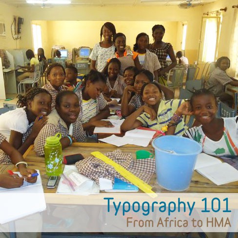
In September, I returned from spending two years in the Peace Corps. My main assignment in Burkina Faso, Africa, was teaching computer science to middle school students. Computers in West Africa? If that was your first thought, you’re not alone. Well, I quickly learned that yes, my village school did have electricity (although not always reliable) and the oldest, missionary-donated computers possible.
So my job – teaching students to properly use the mouse, keyboard and some basic Microsoft Word – was easier said than done, especially in French, a language I learned during my first 3 months in country. Once we finally got through how to move the mouse and how to type, it was on to Word. And you can only guess from my background what I taught them after the basics of saving and saving often – typography!
I can now brag that my 200+ African middle school students understand the difference between serif and sans-serif characters and can distinguish script and decorative typefaces as well. Plus, they know when to properly use them all. And, thankfully, they know if you TYPE IN ALL CAPS IT LOOKS LIKE YOU’RE SCREAMING! (Try teaching that to girls who know it’s easier to type a language, like French, with all of its accents in all caps instead of fighting with the grave accent, cedilla and circumflex. I might have had to demonstrate the screaming in class just to make my point.)
Type – a very underappreciated thing but something vital to our lives. Just remember, choose and choose wisely, and stay away from typing in all caps. Oh, and avoid the fonts Papyrus and Comic Sans. But more on that later.


2 Comments
Great Post!