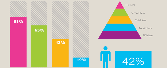
We’ve all seen infographics before, in newspapers, magazines, and online. These little graphical messages that try to convince you to read them because they’re colorful and covered in interesting graphics or cartoons. So, you take a minute to glance over the infographic and then BAM! Before you know it you’ve learned something new, and suddenly you have a new little factoid stuck in your head to pull out at Tuesday night trivia. But are infographic effective, and, more importantly, do infographics effectively communicate your message?
I’ll admit, before I started working at Howard Miller Associates, I never really paid too much attention to infographics. Yes, if I saw one that caught my eye, I would read it, but that was it. It wasn’t until a few weeks ago when we started creating an infographic ourselves that I really began to take notice of just how many infographics there are out there and how interesting they can be. I may be becoming addicted.
Surprisingly, infographics are becoming an extremely popular medium. You may think with digital and social media reigning supreme over the advertising world that infographics would be becoming obsolete, but the opposite is true. Digital tools and social media are the exact vehicles being used to share infographics across the web. They’re everywhere and cover every subject you can think of. Pinterest is littered with them on topics ranging from recycling and food consumption, to sharks, Harry Potter and even proper Twitter manners. They are even becoming interactive, such as one of my current favorites, Every Last Drop, created by Nice & Serious in London. This infographic is displayed in a unique style using parallax scrolling. The site allows you to scroll while the images and messages change in the background, and it ends with a video giving you more information about the use of water. It keeps the audience’s attention and gets its point across in a quick, concise and fun way. I was so intrigued that I instantly shared it with all of my Twitter followers.
Seeing all these infographics really sparked my interest and got me thinking about just how effective they are. So, I decided to do a little research on the subject, and guess what I found….an infographic, surprised? The straightforward facts point out that people are more attracted to visual information and are 30 times more likely to read an inforgraphic than a text article. In fact, the search query “infographic” was conducted on an average of 301,000 times/month last year, and, in March of 2012, #infographic received 56,765 tweets on Twitter (Customer Magnetism).
In my opinion, infographics are effective and will only continue to grow in popularity as digital and social media continue to grow. If you’re looking for an exciting and interesting way to convey information or increase brand awaress, infographics are definitely worth looking into. Do you have any suggestions for other great ways to communicate visually on the web?


5 Comments
Interesting point of view. But do you know scientific papers about infographics that show their effectiveness? (How persuasive they are, for instance).
Fifty percent of the human brain is dedicated to visual functions, and it actually processes images faster than text. This makes infographics a significantly more effective communications tool. And of course, there’s no denying the internet’s potential for the content to go viral and drive traffic.
Edward Tufte has conducted a significant amount of research in the area of information design. I recommend checking out any of his books for an in-depth analysis of data visualizations. Also, this TED Talk by David McCandless provides some quick additional insight.
Getting a little more technical, this research paper from Darmouth College suggests anyone can arrange facts to visually support an argument of their choice. While the researchers are political scientists rather than science scientists, their research still supports the fact that visual communication is an incredibly powerful tool.
Other than the basic psychology behind visual communication and the resources I mentioned above, I haven’t found a significant amount of scientific research specific to using infographics as a marketing tool. But if you stumble on any additional resources, please let us know!
I’ve been researching the topic of infographics and your article really inspired me on writing a complete guide on what is an infographic: https://icons8.com/articles/what-is-an-infographic/
It discusses different types of infographics with actual examples, as well as providing tips on visual elements and sharing a list of services for creating infographics.
I hope it will add value to your article!