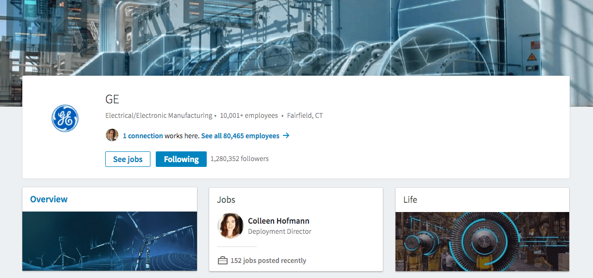
From what we are starting see, LinkedIn is giving ‘company pages’ a new look. Here’s an example of the LinkedIn company page update in beta from our friends at GE:

Does it feel cleaner? That seems to be the goal. Going the way of ‘cards’ or big sections, rather than the old school singular page, LinkedIn breaks up its company pages by ‘Overview,’ ‘Jobs’ and ‘Life.’ The first two sections are true to the existing design, but what should we make of the ‘Life’ category?
This page consists of company leaders, company photos, employee perspectives and cultural insights. Basically, this is all the information you might want to research if you’re applying for a job at a specific company. No big surprises there, right? LinkedIn’s original goal was to focus on job seekers as a target market.
How can you prepare for these updates rolling out to your company page? Take a look at the beta version for GE. As of Wednesday, page admins can get a head start by uploading a new cover image, company logo and tagline now. Finally, keep an eye out for the update to come to you. You’ll be able to take advantage of these new features right away!
Besides the new design for LinkedIn company pages, LinkedIn is also launching a new admin view with in-line editing. LinkedIn says it will make it easier to edit and manage your company’s page. An expanded and much needed analytics dashboard will also help you measure your content’s engagement.
Not sure you have the time to develop content for these updates? Have questions about the changes coming to your LinkedIn company page? We can help!


